Contempo Façades

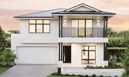
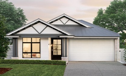
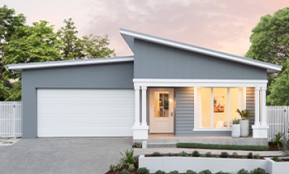
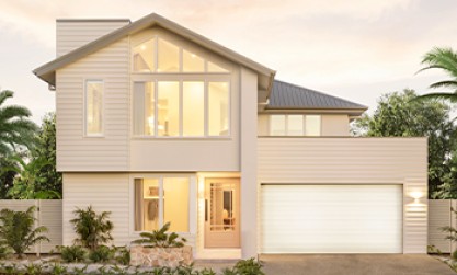
The Contempo style comes from clean lines and simple architectural details. This style can be interchangeable with many modern looks and borrows from various eras. But at it’s core there is one true design element, that is the space itself; an attraction to the form and function rather than just a design aesthetic.
The Contempo style has been broken into four subsets to further explore your preferred design aesthetic within the Contempo style
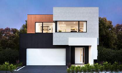
MODERN
Different textures can be applied to the façade, however they should all complement each other. You will also see clean lines and asymmetric design featured throughout this substyle.

Eclipse 32 with Lennox facade on display at HomeWorld Box Hill
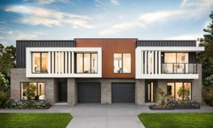
MINIMALIST
Facades in the Minimalist style are fully rendered or brick. If render is being used, ensure it is similar in tone and colour to the brickwork.

Nautica 36 with Sheike facade on display at HomeWorld Warnervale
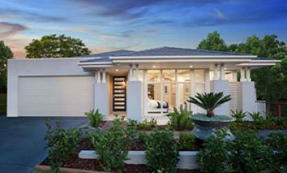
MID-CENTURY MODERN
This style is all about the connection of outside and inside. Ensure large feature glass areas are included in the façade where possible, especially large picture windows and sliding doors.

Enigma 46 with Sheike facade with pitched roof on display at HomeWorld Thornton
SCANDINAVIAN
Ensure a light palette is used on the exterior. If both brick and render are used, keep the render colour similar in tone to the brick to limit contrast.

Conga 26 with Ascot facade on display at Waterford Living
THE OVERALL CONTEMPO FEEL
From the inside, window colours frame your outside view like a picture so use black, silver or richer tones. A mix of external materials creates texture and contrast but always keep them tonal. Use large windows to connect the outside to the inside. Light render colours frame a Contempo style façade.


